Embossing vs. Debossing: Differences in Label Texture
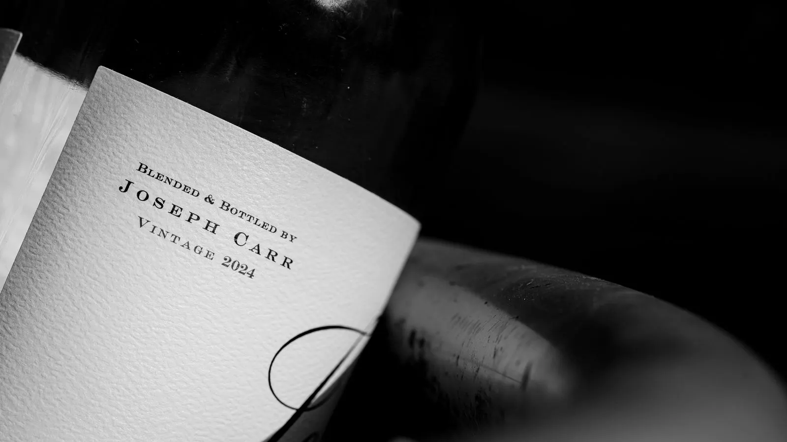
Embossing raises the surface, while debossing presses it down. The choice depends on the desired tactile feel, visibility, material thickness, and the final application. Raised finishes catch light and feel bold. Recessed finishes sit flush and read as subtle.
- Embossing creates raised ridges, while debossing creates recessed depressions.
- Embossed finishes catch light from above and appear brighter.
- Debossed finishes sit flush and often look cleaner and more subtle.
- Material thickness and substrate flexibility affect how both finishes hold up.
- The right choice depends on the intended reader interaction and production constraints.
What Is Embossing vs Debossing in Label Production
Embossing presses a design into the substrate so the image sits above the paper or film surface. Debossing does the opposite. It pushes the design below the surface, creating a recessed impression. The two techniques use similar tooling and presses, but the physical result is a mirror image. One is raised. The other is indented.
This distinction matters when buyers specify label texture. A raised finish changes how light hits the label. A recessed finish changes how a fingertip moves across it. Both options require die preparation, proper inking or coating, and careful pressure control. The wrong choice can make a label look flat, scuffed, or inconsistent across a large run.
How the Physical Surface Differs
An embossed finish creates a peak. The die presses the material outward, or the material is forced up around a raised tool. The edges of the lettering or logo become slightly beveled. Light hits these peaks from the front and reflects directly toward the viewer. This is why embossed text often looks brighter and more three-dimensional.
A debossed finish creates a valley. The design sinks into the material. The edges are pressed inward. When light strikes a debossed area, it reflects off the inner walls of the recess. This can create a darker shadow effect. The finish often reads as softer and more integrated into the label.
The difference is visible without a magnifier, but it is most obvious in raking light. Shine a lamp across the label at a low angle. The embossed ridges cast long shadows. The debossed valleys catch them. This test is a standard part of quality checks for premium labels.
How the Tactile Experience Differs
Touch is a major factor in premium packaging and security labels. An embossed label feels raised. A fingertip slides over the surface and bumps into the peaks. This can feel bold and tactile. It draws attention through touch, not just sight.
A debossed label feels smooth on the surface, with slight dips where the design is. It feels less aggressive. The finger glides over the recesses rather than catching on them. This is often preferred for luxury goods, where the goal is a refined, subtle interaction.
The tactile difference is also a quality indicator. If the embossing is too shallow, the label feels flat. If it is too deep, the material may tear or the ink may crack. Debossing has similar risks. Too much pressure can crush the substrate or create a visible crease. Too little pressure leaves a barely visible impression.
How Durability and Printing Constraints Differ
Both finishes require the substrate to be thick and stable enough to hold the impression. Thin paper or lightweight film may not support a deep emboss or deboss. The material may tear, wrinkle, or spring back. Thicker stocks hold the impression better and resist distortion.
Ink and coating also matter. An embossed area may have ink on the raised surface and none in the recesses, or vice versa. The printer must control ink flow carefully. If ink sits too heavily in a debossed valley, it can dry unevenly or crack as the material flexes. If ink is missing from an embossed peak, the finish may look patchy.
Debossed labels can be more forgiving with some inks because the ink sits within a recess. Embossed labels may require more precise ink coverage to avoid gaps. Both finishes benefit from a good laminate or coating to protect the impression and improve resistance to abrasion.
How Aesthetic and Branding Goals Differ
Embossing is often chosen for labels that need to stand out. It is common on premium beverage cans, high-end cosmetics, security seals, and industrial parts that require tactile identification. The raised surface catches the eye and invites touch.
Debossing is often chosen for labels that need to look clean and integrated. It is common on luxury packaging, pharmaceutical labels, and consumer products where the design should be subtle. The recessed finish looks less busy and can make the label appear more elegant.
The choice also depends on the background color. On dark substrates, an embossed finish can look dramatic because the light hits the peaks. On light substrates, a debossed finish can look crisp because the shadows define the edges. Testers often run small samples on the actual substrate before approving a production run.
When to Pick Each Finish
The table below compares the two finishes for common B2B label applications.
| Option | Best for | Limitations |
|---|---|---|
| Embossed finish | Bold branding, security labels, tactile identification, premium cans and bottles | Can look too loud if the design is complex; requires thicker substrate; may catch dust in the crevices |
| Debossed finish | Luxury packaging, subtle branding, clean aesthetic, pharmaceutical and cosmetic labels | Can look faint on light backgrounds; requires careful ink control; may not be as noticeable in low light |
| Combined emboss and deboss | Complex logos with both raised and recessed elements | More complex tooling; higher setup cost; requires precise pressure control |
| No emboss or deboss | Standard labels, low-cost runs, digital printing | Lacks tactile interest; relies on color and ink alone |
Choose embossing when the label needs to be felt as well as seen. It works well for brands that want a strong physical presence. The raised surface also helps with accessibility, as it can be read by touch. This is useful for labels in environments where users may not always look closely.
Choose debossing when the label needs to look refined and quiet. It works well for luxury goods and products where the packaging is already ornate. The recessed finish adds depth without adding visual noise. It is also a good choice for labels that will be stored in tight spaces, as the surface is less likely to snag on other items.
How to Test Embossing vs Debossing Before Production
Always request a physical proof. A digital mockup cannot show the texture. The proof should be printed on the actual substrate and run through the same press as the final run. Check the impression under raking light. Check the ink coverage. Check the edge crispness.
Measure the depth of the impression if possible. A caliper or a simple feeler gauge can give a rough estimate. For embossed labels, the peak should be consistent across the label. For debossed labels, the valley should be uniform. Inconsistent depth is a common quality failure.
Check the label after it has been through a handling cycle. Fold it gently. Rub it with a clean cloth. Look for cracks, tears, or ink loss. Embossed labels are more vulnerable to cracking if the substrate is too thin. Debossed labels are more vulnerable to ink smudging if the recess is too shallow.
Finally, check the label in its intended environment. If it will be on a shelf with other labels, see if the embossing or debossing stands out or blends in. If it will be in a low-light area, check if the finish is still visible. The goal is to match the finish to the use case, not just to the aesthetic preference.
How Cost and Lead Time Compare
Both embossing and debossing require a die. The die is a metal or plastic plate that carries the design. Creating the die takes time and money. The cost depends on the complexity of the design. A simple logo is faster and cheaper than a detailed image with fine lines.
The production run itself requires careful setup. The press must be calibrated for pressure and temperature. This adds time to the production schedule. A standard label run may take a few days longer than a run without embossing or debossing.
The cost of the finish itself is usually a small part of the total label cost. The bigger costs are the die, the substrate, and the run length. Short runs with embossing or debossing can be expensive per label because the die cost is spread over fewer units. Long runs are more economical because the fixed cost is diluted.
If the label design changes often, a combined approach may make sense. Use embossing for the main logo and debossing for secondary text. Or use one finish for the primary label and none for the secondary label. This keeps the production process manageable while still adding tactile interest.
Frequently asked questions
Which finish is more durable, embossing or debossing?
Both finishes are durable when the substrate is thick enough and the ink is properly applied. Embossed labels can be more vulnerable to cracking if the material is thin. Debossed labels can be more vulnerable to ink smudging if the recess is shallow.
Can embossing and debossing be used on the same label?
Yes. A single label can have both raised and recessed elements. This requires a more complex die and careful pressure control. It is often used for premium packaging where the design has multiple layers of detail.
What substrate thickness is needed for embossing or debossing?
Thicker substrates hold the impression better. Thin paper or lightweight film may tear or spring back. The exact thickness depends on the material and the depth of the impression. A sample proof is the best way to confirm.
How does the finish affect the label cost?
The main added costs are the die and the extra setup time. The per-label cost of the finish itself is usually small. Short runs can be more expensive because the fixed die cost is spread over fewer units.
How do I check if the embossing or debossing is done correctly?
Check the impression under raking light. Check the ink coverage. Check the edge crispness. Measure the depth if possible. Check the label after a handling cycle to look for cracks or ink loss. The goal is consistency across the entire run.